Latest News
Three rescuers suffer heat-related illness after rescuing injured hiker on Appalachian Trail
Alec Linden
Jul 10, 2026
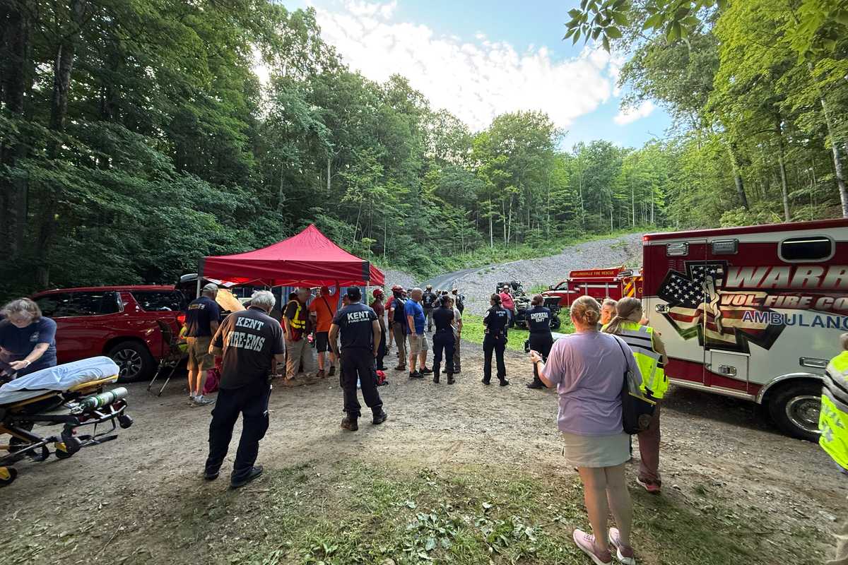
75 rescuers from 15 response teams across Litchfield and Dutchess Counties retrieved an injured and stranded hiker from the Appalachian Trail on Thursday afternoon, July 9. Hot and humid conditions complicated the effort, injuring three rescuers who have since recovered.
Courtesy of Kent Volunteer Fire Department
KENT – An injured hiker was rescued from a rugged section of the Appalachian Trail on Thursday, July 9, but the extreme heat took a toll on rescuers as well, leaving three first responders with heat-related illnesses. All four individuals were in stable condition Friday morning.
The hiker, who was hiking with at least one other person, was found to be dehydrated and suffering from heat-related illness on a section of the trail between the Schaghticoke campsite and Mount Algo campsite. The rescue drew about 75 emergency responders from Connecticut and New York. Responders were dispatched at 12:30 p.m. after a 911 call was placed, and crews wrapped up the scene around 7:30 p.m.
Kent Volunteer Fire Department Chief Tim Sneller said the injured hiker was rescued on “steep and rocky” terrain about two miles from the nearest road access.
“I think this is the roughest part of the Appalachian Trail in Connecticut,” Sneller said. He added that this was the second trail rescue his team had performed this year, but the terrain and weather conditions made the effort on Thursday afternoon especially complicated, with high temperatures in the low 90s and a high humidity index.
Two first responders were treated on scene, he said, while the third was hospitalized but later released.
“I spoke to him and he’s doing well,” Sneller said.
The KVFD was aided in the rescue by teams from the Gaylordsville Volunteer Fire Department, Sherman Volunteer Fire Department, Warren Volunteer Fire Company Inc., Sharon Fire Department Inc and Sharon Ambulance, New Milford’s Water Witch Hose Co. No. 2, Roxbury Fire and EMS, Cornwall Volunteer Fire Department, Bantam Fire Company, County Coordinator, Northwell Medic Nos. 4 and 5, Washington Volunteer Fire Department. J.H. Ketcham Hose Company, Amenia Fire Company and Empress Medic.
Some of the responding crews were dispatched as backup after several firefighters began experiencing heat illness and had to be removed from the rescue effort and treated.
Sneller advised any who go hiking during the hot summer months to “bring plenty of fluids and a charged phone.” In an emergency, “call us sooner rather than later,” he said.
Keep ReadingShow less
Storm-damaged White Hart presses on with NASCAR Pit-Stop Party
Annie Prinz
Jul 10, 2026

The hauler of two-time NASCAR Craftsman Truck Series champion Ben Rhodes, of ThorSport Racing, rolls past The White Hart on Thursday, July 9, as spectators cheer along the route.
Madi Long
SALISBURY — Days after the July 4 storm left the White Hart Inn and much of Salisbury without power, electricity was restored 24 hours before the NASCAR CRAFTSMAN Truck Series Hauler Parade on Thursday, July 9, giving staff just enough time to salvage the inn’s planned pit-stop party.
Staff, community members and clean-up crews worked around the clock to clear storm debris from the White Hart lawn, allowing the inn to deliver on its promise of prime parade viewing.
Although the storm claimed one of the property’s largest signature trees, the lawn was ready by Thursday afternoon as fans gathered with drinks and popcorn to watch the haulers pass by at 4:30 p.m.
The inn opened its outdoor bar and indoor taproom, while Lime Rock Park sponsors, including Coca-Cola and Foolproof Brewing Company, served beverages to the crowd.
White Hart Inn Hotel Manager Dan Winkley said the experience underscored how much the community can accomplish when people come together.
“It’s definitely been challenging, and yet at the same time so rewarding to see the communities, our team, our neighbors and private and public companies come together and really work to get this town cleaned up,” Winkley said.
The July 4 storm brought down one of the inn's largest trees, pulling power lines with it and leaving the property, its guests and neighboring residents without electricity and internet service for several days.
Winkley said power was restored Wednesday, just one day before the pit-stop party, allowing staff to finalize plans for the event and determine what they could realistically offer guests.
Thursday's sunshine was a welcome change after days of rain and cleanup efforts.
Adding to the atmosphere, Foolproof Brewing Company of Bridgeport offered samples of its Lime Rock Park brews, including Lefthander Lager and Race-Day IPA. Spencer Churchill, director of operations at the Bridgeport location, said the company has created a special-edition can for every race since partnering with Lime Rock last year. For the NASCAR weekend, Foolproof served Stock Car IPA.
NASCAR drivers stopped by the lawn around 4:45 p.m. to sign autographs as fans lined up to meet them. One fan, Carl from Long Island, who also attended the NASCAR weekend last year, said the return of the series was worth the trip.
“For me at least, last year was like a dream weekend,” he said, adding that the now 30-year-old has been a NASCAR fan since he was four. “I always thought the Truck Series would be perfect for Lime Rock, and it was everything I could’ve hoped for. As long as they keep coming back, I’m gonna keep showing up.”
The event was a preview of the weekend to come. Lime Rock officials, who also worked around the clock to clean up significant storm damage to the track, said they were ready for the race.
Chief Marketing Officer Jamie Kistner said they received “incredible help” from volunteers and sponsors, including Housatonic Racing Development, Geoff’s Equipment, Green Acres Landscaping and Segalla Construction. He also expressed gratitude to Lime Rock’s maintenance staff for all their hard work in getting Lime Rock race-ready.
Keep ReadingShow less
Legal Notices - July 9, 2026
Lakeville Journal
Jul 09, 2026

Legal Notice
BOND RESOLUTION DATED JUNE 15, 2026 OF THE BOARD OF EDUCATION OF THE WEBUTUCK CENTRAL SCHOOL DISTRICT AUTHORIZING NOT TO EXCEED $429,327 AGGREGATE PRINCIPAL AMOUNT OF GENERAL OBLIGATION BONDS AND/OR INSTALLMENT PURCHASE CONTRACTS TO FINANCE THE ACQUISITION OF A SCHOOL BUSES AND VEHICLES AT AN AGGREGATE ESTIMATED MAXIMUM COST OF$429,327, LEVY OF TAX IN ANNUAL INSTALLMENTS IN PAYMENT THEREOF TAKING INTO ACCOUNT STATE-AID, THE EXPENDITURE OF SUCH SUM FOR SUCH PURPOSE, AND DETERMINING OTHER MATTERS IN CONNECTION THERE-WITH.
WHEREAS, the qualified voters of the Webutuck Central School District, New York (the “School District”), at the annual meeting of such voters duly held on the 19 th day of May, 2026, duly approved a reposition authorizing the issuance of general obligation bonds and notes and/or entering into installment purchase contracts in an aggregate principal amount of not to exceed $429,327 to finance the acquisition of two (2) 64-passenger school buses and one (1) Bobcat Multipurpose vehicle, the expenditure of such sum for such purposes, and the levy of the necessary tax therefor, to be levied upon the taxable property of the District and collected in annual installments as provided by Section 416 of the Education Law, taking into account state-aid received;
NOW THEREFORE, BE IT RESOLVED BY THIS BOARD OF EDUCATION AS FOLLOWS:
Section 1. The School District shall acquire two (2) 64-passenger school buses and one (1) Bobcat Multipurpose vehicle at a cost not to exceed$429,327, as more particularly described in Section 3 hereof, and as generally outlined to and considered by the voters of the School District at the annual District meeting of May 19, 2026.
Section 2. The School District is hereby authorized to issue its general obligation bonds (the “Bonds”) in the aggregate principal amount of not to exceed $429,327 pursuant to the Local Finance Law of New York and/or enter installment purchase con-tracts pursuant to the General Municipal Law of New York, in order to finance the class of objects or purposes described herein.
Section 3. The class of objects or purposes to be financed pursuant to this Resolution (the “Purpose”) is the acquisition of two (2) 64-passenger school buses and one (1) Bobcat Multipurpose vehicle.
Section 4. It is hereby determined and declared that (a) the maximum cost of the Purpose, as estimated by the Board of Education, is $429,327, (b) no money has heretofore been authorized to be applied to the payment of the cost of the Purpose, and (c) the School District plans to finance the cost of the Purpose from funds raised by the issuance of the Bonds and bond anticipation notes, and/or the proceeds of installment purchase agreements hereinafter referred and the aid received from the State of New York.
Section 5. It is hereby determined that the Purpose is one of the class of objects or purposes described in Subdivision 89 of Section 11.00 of the Local Finance Law, and that the period of probable usefulness of the Purpose is five (5) years.
Section 6. Subject to the provisions of the Local Finance Law, the power to authorize the issuance of and to sell bond anticipation notes in anticipation of the sale of the Bonds, including renewals of such notes, is hereby delegated to the President of the Board of Education, the chief fiscal officer. Section 7. The power to further authorize the issuance of the Bonds and bond anticipation notes, including renewal notes, and to prescribe the terms, form and contents of the Bonds and bond anticipation notes, including the consolidation with other issues and the use of substantially level or declining debt service, subject to the provisions of this Resolution and the Local Finance Law, and to sell and deliver the Bonds and bond anticipation notes, is hereby delegated to the President of the Board of Education. The President of the Board of Education is hereby authorized to sign and the District Clerk is hereby authorized to attest any Bonds and bond anticipation notes issued pursuant to this Resolution, and the District Clerk is hereby authorized to affix to such Bonds and bond anticipation notes the corporate seal of the School District. Section 8. The faith and credit of the Webutuck Central School District are hereby irrevocably pledged for the payment of the principal of and interest on such Bonds and bond anticipation notes as the same respectively become due and payable. An annual appropriation shall be made in each year sufficient to pay the principal of and interest on such obligations becoming due and payable in such year. There shall be levied annually on all taxable real property of the School District, a tax sufficient to pay the principal of and interest on such obligations as the same become due and payable.
Section 9. This Bond Resolution shall constitute the School District’s “official intent”, within the meaning of Section 1.150-2 of the Treasury Regulations, to finance the cost of the Purpose with Bonds and notes herein authorized. The School District shall not reimburse itself from the proceeds of the Bonds or notes for any expenditures paid more than sixty days prior to the date hereof, unless specifically authorized by Section 1.150-2 of the Treasury Regulations. Section 10. The power to further authorize the execution of installment purchase agreements and to prescribe the terms, form and contents of the installment purchase contracts, subject to the provisions of this Resolution and the General Municipal Law, is hereby delegated to the President of the Board of Education. The President of the Board of Education is hereby authorized to sign and the District Clerk is hereby authorized to attest any installment purchase agreements entered into pursuant to this Resolution, and the District Clerk is hereby authorized to affix to such installment purchase agreements the corporate seal of the District. Section 11. This Resolution, or a summary there-of, shall be published by the District Clerk of the School District together with a notice in substantially the form prescribed by Section 81.00 of the Local Finance Law, and such publication shall be in each official newspaper of the School District. The validity of the Bonds or of any bond anticipation notes issued in anticipation of the sale of the Bonds may be contested only if such obligations are authorized for an object or purpose for which the School District is not authorized to expend money, or the provisions of law which should be complied with at the date of publication of this Resolution are not substantially complied with, and an action, suit or proceeding contesting such validity is commenced within twenty (20) days after the date of such publication; or if said obligations are authorized in violation of the provisions of the Constitution. Section 12. The law firm Barclay Damon LLP, is hereby appointed as bond counsel to the School District in connection with the issuance of the Bonds and bond anticipation notes authorized herein.
Section 13. This Resolution shall take effect immediately upon its adoption.
07-09-26
NOTICE TO CREDITORS ESTATE OF BERNADETTE A.
GANDOLFO,
Late of Salisbury,
AKA BERNADETTE GANDOLFO
(26-00201)
The Hon. Jordan M. Richards, Judge of the Court of Probate, District of Litchfield Hills Probate Court, by decree dated May 28, 2026, ordered that all claims must be presented to the fiduciary at the address below. Failure to promptly present any such claim may result in the loss of rights to recover on such claim.
Robert A. Gandolfo
c/o LINDA M PATZ, DRURY, PATZ & CIT-RIN, LLP,
7 CHURCH STREET,
P.O. BOX 101, CANAAN, CT 06018
Jordan Bergs,
Clerk
07-09-26
NOTICE TO CREDITORS ESTATE OF EDLA F. CUSICK
Late of New York
(26-00073)
The Hon. Jordan M. Richards, Judge of the Court of Probate, District of Litchfield Hills Probate Court, by decree dated April 30, 2026, ordered that all claims must be presented to the fiduciary at the address below. Failure to promptly present any such claim may result in the loss of rights to recover on such claim.
The fiduciary is: Douglas Clifford
c/o EMILY D VAIL VAIL & VAIL, LLC
PO BOX 568 SALISBURY, CT 06068
Jordan Bergs Clerk
07-09-26
Keep ReadingShow less

Want more of our stories on Google? Click here to make us a Preferred Source.
Tenmile Distillery is making history the old-fashioned way
D.H. Callahan
Jul 08, 2026

Cheers! The Revolutionary Whisky Series at Ten Mile Distillery, each named for a significant battle of the American Revolution, celebrates America at 250.
D.H. Callahan
In December 2024, the U.S. Alcohol and Tobacco Tax and Trade Bureau officially established the Standard of Identity for American Single Malt Whisky. It was the first new classification in more than half a century, creating new possibilities for American distillers. One of the distilleries taking advantage of this new landscape is Wassaic’s Tenmile Distillery. It is well positioned to make history because Tenmile has always honored traditional whiskey-making practices.
Single malts are often associated with Scotch whisky. Perhaps that’s why, years before the new standard was adopted, Tenmile hired Shane Fraser, a Scottish master distiller with 30 years of experience at some of Scotland’s most prestigious distilleries. Fraser began designing the distillery from the ground up. Alongside owner and general manager Joel LeVangia, he emphasized time-honored traditions, favoring hands-on craftsmanship over the increasingly automated methods used by larger producers. When it comes to making the best whisky possible, Tenmile believes in learning from the past. That philosophy extends beyond the distilling process.
 D.H. Callahan
In late 2025, in anticipation of the 250th anniversary of the signing of the Declaration of Independence, the distillery introduced its Revolutionary Whisky Series. The collection features 57 unique expressions, each with its own combination of barrel types and aging periods, and each named for a significant battle of the American Revolution.
LeVangia sees the series not only as something collectible — a hallmark of the international craft distilling world — but also as an opportunity to educate. Most Americans learn about the Revolution in high school U.S. history classes, but LeVangia wanted to go beyond familiar stories such as Washington crossing the Delaware or the famous command to wait until soldiers could see “the whites of their eyes.” Each bottle helps tell a deeper story.
To bring those stories to life, Tenmile has gone the extra — dare they say, 11th — mile. Tom Bouldin, Ph.D., serves as the distillery’s historian. He consults on the series, helping LeVangia and Fraser connect each expression to an appropriate battle of the American Revolution. He also leads Tenmile’s lecture series. While some of Bouldin’s talks explore the history of popular music, his primary focus is the battles of the American Revolution.
With each new release, Tenmile hosts an intimate evening of history and whisky tasting. Centered on Bouldin’s meticulously researched lectures, the events often spark broader conversations about the battles, the people who fought them and what those events still mean today. It’s a style of promotion rarely seen today. Although the distillery and its grounds are stunning, these gatherings are not designed as Instagram photo opportunities. Instead, they bring together a small group of people eager to learn from the past while tasting something new.
That is what the Revolutionary Whisky Series — and Tenmile Distillery as a whole — is all about: learning from history while forging its own.


Keep ReadingShow less
The magic of Belinda Sinclair
D.H. Callahan
Jul 08, 2026
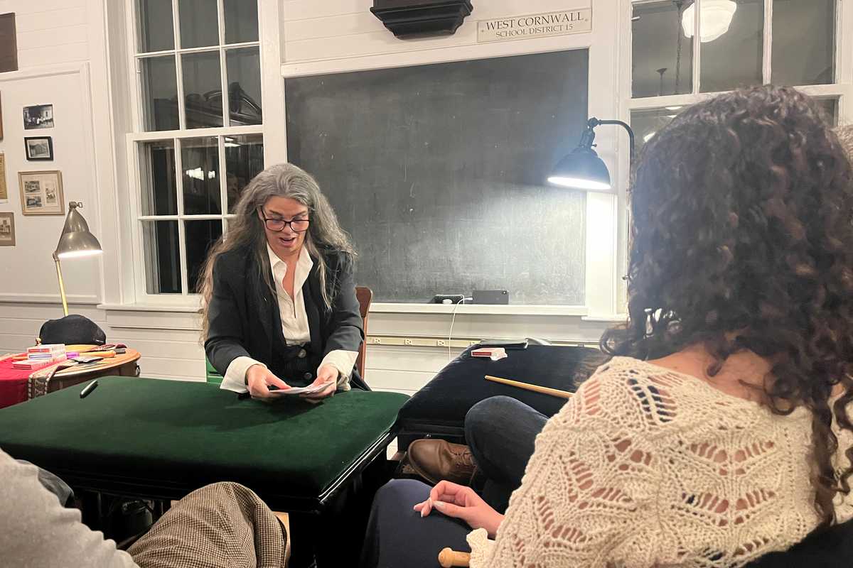
Belinda Sinclair
Dean Chamberlain
Sinclair’s show explores the ways women have been practicing forms of magic for centuries, and there is plenty of history to tell.
Belinda Sinclair is the kind of magician who impresses people who don’t like magic. Her tricks are mind-boggling. Her stories are captivating. And if she picks you to write your name on a card, get ready to be wowed. Repeat attendees of her shows, of which there are many, take almost as much delight in watching new jaws drop as they do in seeing an illusion reach its astonishing conclusion.
Since the summer of 2025, Sinclair has been baffling local audiences at the Hughes Memorial Library in West Cornwall, but her magical run comes to a close at the end of August.
For 45 years, Sinclair, a New York City native, has been hosting small, intimate performances in the “Conjuring Room,” her Victorian parlor in Hell’s Kitchen. It’s a place made for magic, with built-in surprises designed to disorient. But the Hughes Library doesn’t have the same potential to perplex. The room is, as the name suggests, a library, with shelves packed tightly with old books. Some of those books, stocked by Sinclair herself, dive into the history of women and magic. That particular topic is the organizing principle of her show.
Today, we live in a world with large-scale magic productions from household names like David Blaine. Penn & Teller and Criss Angel had widely popular television series, while performers like magician and comedian Justin Willman have found audiences on Netflix. David Copperfield, the most commercially successful magician in history, only recently had his 25-year Las Vegas residency cancelled, after allegations connected to the Jeffrey Epstein investigation resurfaced. But very few women, arguably none, have reached the highest levels of fame in the magic world.
Sinclair’s show explores the ways women have been practicing forms of magic for centuries, and there is plenty of history to tell. Her head is simply full of historical anecdotes and interpretations. She seems to know everything there is to know about magic and how, over the centuries, it has been feared and misunderstood.
It’s knowledge she acquired through decades in the world of magic. Sinclair got her start by accident. After graduating from New York City’s High School of Performing Arts, she was hired to entertain a long business conference as a clown. Despite having no clowning experience, she did so well that she was hired for a party on the spot where she was expected to perform magic. She didn’t know a single trick. So she headed to Tannen’s, the legendary Manhattan magic shop that is still open to this day, and asked them to teach her.
She was so captivated by the first trick she learned that she soon began illustrating the shop’s newsletter, the “Trickune.” Soon, she had worked her way into the world of magic. But her trajectory seemed limited. Women in magic were, and frequently still are, relegated to the role of “lovely assistant,” and Sinclair was no exception. She played along, laughing at the bad jokes and flirting with the right men, all the while knowing she could perform better than most of them.
Soon, she stopped playing along. She started developing her own routines. She became increasingly proficient with a deck of cards. She practiced and practiced and practiced. Eventually, the magic establishment took notice of this young magician with the audacity to be a woman.
As her reputation grew, so did the challenges she faced. Breaking into the inner circles of magic is no easy task, but Sinclair knew that if she wanted to be taken seriously, she needed to impress the people at the top. The Magic Circle, a prestigious British society whose members have included Penn & Teller, Stephen Fry and King Charles III, evaluates prospective members through a rigorous performance examination that includes required tricks. Sinclair earned a perfect score of 100 out of 100, proving not only that a woman could perform magic, but that she could perform it as well, if not better, than anyone.
As remarkable as her skills are, there’s a lot more to Sinclair than magic. She’s a ceramicist, hypnotherapist, author, game creator, actor and coder. But perhaps most importantly, she’s a teacher.
Sinclair thrives on helping others navigate through whatever obstacles life throws their way. For a time, that meant helping military veterans with PTSD transition to civilian life. She teaches children how to code so they can build their own websites. She works with unhoused children, using magic to boost their confidence. But if she has her way, the most important lesson she can teach is that with the right amount of work and determination, anyone — and especially little girls — can do the impossible.
Keep ReadingShow less
“Nixon in China” comes to Tanglewood
Richard Feiner And Annette Stover
Jul 08, 2026

Renée Fleming, Andris Nelsons and Thomas Hampson.
Hilary Scott
On Friday, July 17 at 8 p.m. in the Koussevitzky Music Shed at Tanglewood, two of the greatest American voices of their generation, soprano Renée Fleming and baritone Thomas Hampson, join Music Director Andris Nelsons and the Boston Symphony Orchestra in a performance of excerpts from John Adams’ groundbreaking opera “Nixon in China.” The piece, performed earlier this year in Boston and at Carnegie Hall in New York City, is a highlight of a program that also includes “Meditations on Grace” (2024) by BSO Composer Chair Carlos Simon, and the melodic and technically demanding Violin Concerto by Samuel Barber.
Fleming is internationally celebrated for her vocal and dramatic artistry, as well as for her advocacy for the powerful impact of the creative arts in health. Hampson has long been recognized as one of the most innovative musicians of our time and has received countless international honors for his singular artistry and cultural leadership. Both performed in “Nixon in China” earlier this year at the Paris Opera under the baton of Kent Nagano.
Adams’ “Three Scenes from Nixon in China” is a suite taken from the opera and prepared especially for the BSO performances with Fleming and Hampson in the roles of Pat and Richard Nixon. The suite includes Act I, Scene I, in which the Nixons arrive in Beijing; Pat Nixon’s “This is prophetic” aria from Act II, Scene I; and Nixon’s speech followed by a chorus of toasts and cheers (“Gam bei!”) in Act I, Scene III.
The full opera premiered in 1987 and has become one of the most celebrated works of contemporary American music. As The New Yorker wrote, “Not since ‘Porgy and Bess’ has an American opera won such universal acclaim as ‘Nixon in China.’”
The libretto is based on Nixon’s groundbreaking February 1972 visit to reestablish diplomatic ties with the People’s Republic of China. The production was controversial at the time: an opera about a recent American president whose resignation was still vivid in the country’s memory. Created by a first-time opera composer, a poet new to opera (Alice Goodman) and a young avant-garde director (Peter Sellars), the piece defied expectations of what a contemporary opera could be.
Yet “Nixon in China” has proved to be something far more than a provocation; it has been hailed as helping to revitalize American opera. It uses realistic scenarios based on recent historical events to make direct statements about big social questions, especially the status of women in history and society. It is also credited with helping to create the subgenre of the “headline opera,” works that refract the mythology of recent real-life events and personalities through the lens of operatic music, words and staging.
Adams’ score is a dazzling fusion of rhythmic vitality and luminous choral textures with the psychological intricacy of character drama. It reflects the composer’s ongoing search, as he has put it, to find “the sacred in the everyday.” The result is a distinctive kind of music theater that transforms historical and contemporary narratives into modern parables in order to explore the tension between public facade and private reckoning, and between human motive and moral choice.
This Tanglewood concert promises to be a highlight of the summer’s music season. It is part of the BSO’s E Pluribus Unum festival, a multiyear celebration that shines a spotlight on American music to explore the country’s history and ideals and to raise critical questions on topics that shape our collective experience.
For more information and to purchase tickets, visit bso.org.
Keep ReadingShow less
Want more of our stories on Google? Click here to make us a Preferred Source.
loading